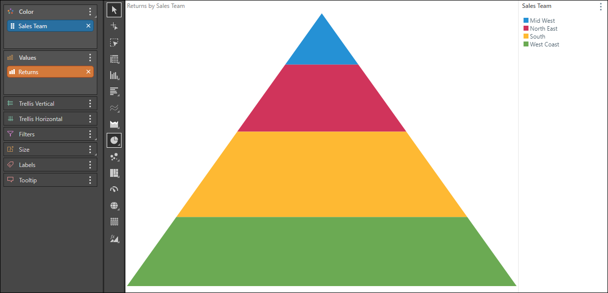
Use a pyramid chart to visualize your data hierarchically; each segment is displayed as a proportion of the total, from smallest to largest. In the example below, we see Returns by Sales Team. The top segment represents the team with the fewest returns.
As with the other segment charts, pyramid charts require a member hierarchy in the Color drop zone, and a measure in the Values zone.
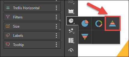
Build a Pyramid Chart
To build a Pyramid chart, follow the same steps for building a doughnut chart, making sure to select Pyramid chart from the fly-out menu at Step 2.